FW 22/23: The notes from fashion weeks about the best and the rest
The fashion community complains again about the lackness of new ideas and the prevalence of “copy-paste” styling in the collections of most of the brands. But there were few collections I liked.
The dreadful news hit Europe in the middle of Milan fashion week, so the rest of the shows during Paris were coloured into yellow-blue context even when there was no actual change in the way the shows were prepared. Why is it important?
Why do I start from the context instead of moving directly to my notes? Because the trends we see and the collections that buyers will buy these days might be completely out of the customers moods in a month or so. Fall and winter 2022 are promised to be different from our expectations, and unfortunately no one can predict how much different. How will the Ukrainian crisis change the world economy, cultural background and the fashion industry? I will try to find the answer, or at least sketch the direction we are moving to, in my next article.
But, back to the fashion weeks. The fashion community complains again about the lackness of new ideas and the prevalence of “copy-paste” styling in the collections of most of the brands. But there were few collections I wouldn’t mind having in my closet.
Contrast is everything
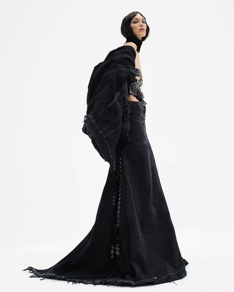
First of all I would choose Marc Jacobs’s skirts and tops. I can’t say he did something extremely revolutionary, I have a Replay skirt from 2013, if I’m not mistaken, that goes straight to the trend. By the way, super long jean skirts are not just in Marc Jacobs collection, so it’s cool now. If you have something from 90s-2000s it’s the time to refresh the look.
I’ve written about it in my post on Instagram, I still think the same. A cool mixture of Rick Owens’s spirit with touch of sportive oversized down jackets and coats so loved after VETEMENTS, Off-white and Balenciaga made a fortune on them, japanese deconstruction in the fusion of Marc’s own grunge and glamorous past. Exaggerated volume contrasts with exaggerated slim fit super long silhouettes.
The same contrast goes for many collections. I think it’s worth mentioning Anthony Vaccarello’s collection for YSL now. The opposite end of the trend. And, I think, the best work of Vaccarello for the brand. Ultimate elegance that really speaks to Saint-Laurent’s esthetics. The contrast of volume and fineness of the silhouettes is supported by the heaviness and lightness of the layered materials. Rough musculine wide shoulder coats over the floating shimmering semi transparent silk dresses - what can underline the fragility of femininity better?
There’s a lot of fur, but all is artificial, just as was promised by the brand's memorandums issued last year. On the other hand I can’t imagine who would buy artificial fur for the same money as natural.
From this point I have a choice to move to the light feminine collections or to go for the rough and avantgarde. Something tells me that it’s better to leave the heavy and complex stuff for the end of the article. So, madames… here we go.
Femininity or else?
Fluidity, fragility, sensuality - all that stand next to french “liberté, égalité, fraternité”. Fendi, Rochas, Lanvin.
First has a thing for acid pastels and trashy mix with sexy underwear, second is about quite cool knee long light dresses with heavy coats, with a touch of underground black, harlequinesque, asymmetry in cuts, third is for historical charm to super femininity. I love their prints and embroideries. And another thing is all of them have more conservative parts of their collections that stand for suits. Fendi by Kim Jones has musculine version for a bit aggressive office girls, that know everything about deconstruction and asymmetry but prefer to doze it. Rochas is for classical interpretation of modest french underground. Lanvin is Tom-Ford-and-Prada-meets-YSL kind of chic.
Something about status? I’m not sure…
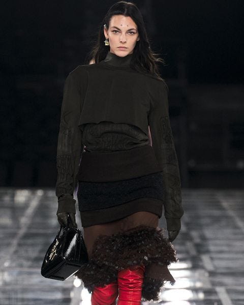
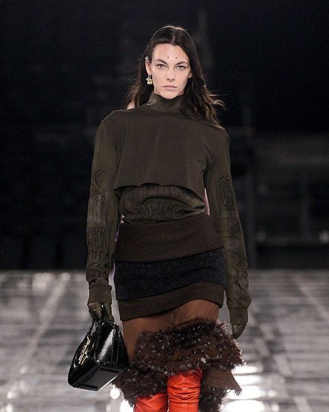
Prada and Givenchy. Both went for cultural contrasts that ended in glamorous skirt fittings with sportive tops.
Prada stays in the intellectual charismatic young woman playground. Maybe that girls are with some political agenda but they are still from a good family. Which is fine. Classical coats with super wide shoulders, oversized. Old trend. It’s ok, fresh styling works for evolution, I guess.
Givenchy slid into the rock underground. It feels strange for the brand esthetics and codes, especially when I think about Audrey Hupburn. But as far as she’s now reserved as a face for LVMH’s other gem - Tiffany’s - I guess it’s ok. I personally like rock styled looks more than unclear feminine intentions in the rest of the collection. The overall impression from Matthew Williams for this brand is a bit confused, unlike my emotions after watching Prada’s collaboration of Raf Simmons and Miuccia Prada.
Sophisticated elegance
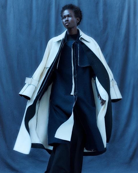
I’m in love with those 2 collections. I like how they were styled, how imperfectly perfect they are in cuts and forms. Uma Wang’s wool suits and coats, and all of Ashlynn by Ashlynn Park, former Yohji Yamamoto pattern maker. Yes, we can find some citations but all together it’s wearable, weird, enough authentic and smart design. Impossible not to respect it.
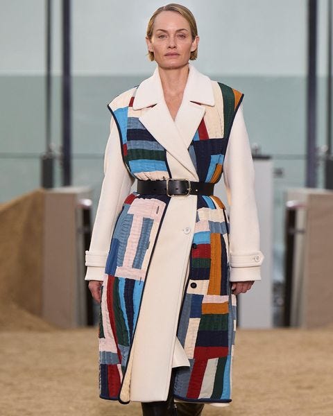
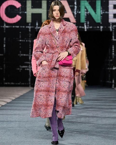
But if you stand for classic elegance then Chanel and Chloe made it just fine. Not WOW, but, you know, they closed the subject of simple cosy smart pret-e-porte. Knitting at Chloe is especially nice. It’s not a fashion for the sake of fashion, it’s for actual women who like and have the opportunity to buy mindfully expensive clothes. Gabriela Hurst made it sustainable. Virginie Viard in Chanel continued her journey into a calm charm of bourgeoisie.
The same names
Dior FW22/23 collection by Maria Grazia Chiuri deserves a stand alone post, so I’ll make it quick and say that there were contradictions in the concept of the show pieces. They used technological design for sportive protective wear (collaboration with D-Air Lab) that was basically not more than the new accessories. And the whole other things were typical Dior of the last few seasons, but in brown with checks or printed plant patterns inspired by Dior’s interiors. As usual embroideries were outstanding quality, as well as laces. In general it was good quality clothes accompanied by stylish jewellery.
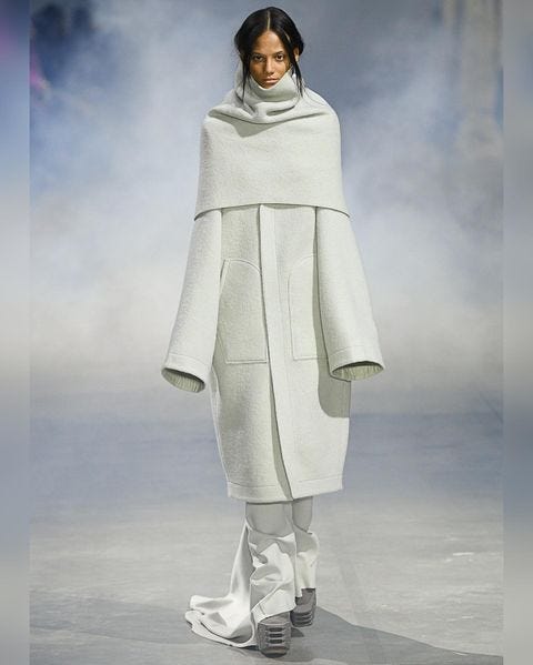
Rick Owens showed usual Rick Owens which means usual excellence. His silhouettes are there, shoulders either are extremely pointy and narrow or round and wide, his favorite distortions shaped as extra tissue folds. The looks came out long, slim and liquid because of the textile quality. Again they were styled with contrast voluminous down jackets and oversized plain coats. My personal choice are sequin evening gowns.
Dries Van Noten for the first time after 2019 made an offline presentation, but that wasn’t a show. Again it’s difficult to say something that wasn’t said before about his unique sense of color and composition balance. He’s the only designer who can combine floral and animalistic patterns of bright colours that you would never think to put together. And the results are always sophisticated and exquisite. The main thing in cuts - are circle shaped jackets and coats. I can’t say they look organic. I thought (for no reason probably) about Kansai Yamamoto’s bodysuit designed for David Bowie’s Aladdin Sane Tour in 1973: huge round trousers, slim upper part. Dries makes me feel like he looked through a 60s graphic obsession with futurism and just turned the shape of that bodysuit upside down. Of course there are more appropriate associations. I choose that one only because it doesn’t feel like Van Noten, who usually goes for less geometry and more textile content with straight, very clear and simple cuts.
Japanese arthouse
Finally I reached the group of Japanese designers that are usual stars of the PFW. For different seasons I wouldn’t introduce them together because they are different creatives and the results of their work is never the same. But this time there are particular similarities in silhouettes and volume of their looks. Different interpretations, completely different textiles and cuts, but I see them as a group nevertheless.
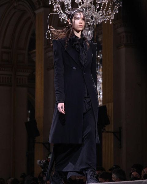
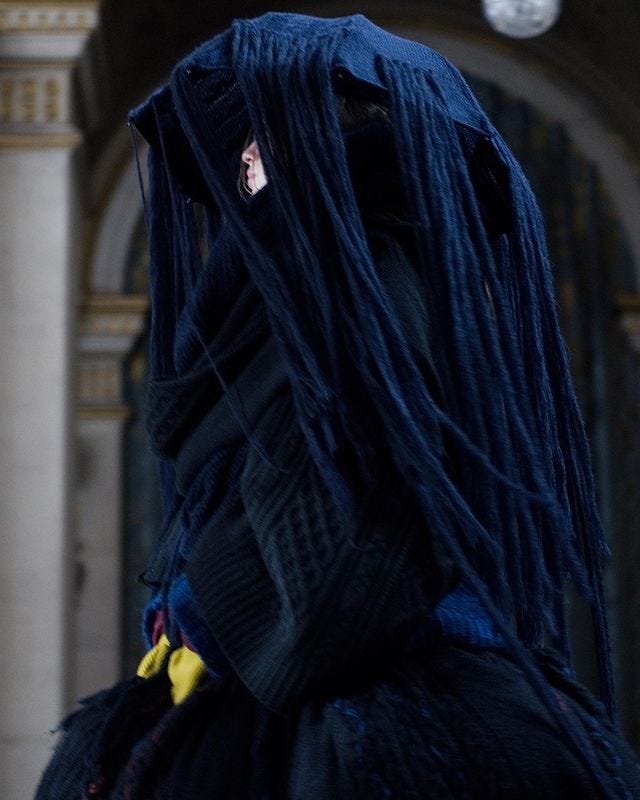
Most of all I enjoyed the collection of Yohji Yamamoto. No matter how complicated the layering and asymmetry of cuts look, it's always clear in the concept. You can see the details, the story is always about fashion and life, not pure art. You can take off one garment and use it with other brands without looking like total look “Yohji”. You can’t do it with Comme des Garcons, for example.
The most amazing thing about him for me is that he can fuse Japanese traditional cuts and clothes into European fashion, including elements of historical costumes. There’s of course theater in that kind of styling, but in a decomposed state, each thing of each look is independent and can leave its own life in the wardrobe.
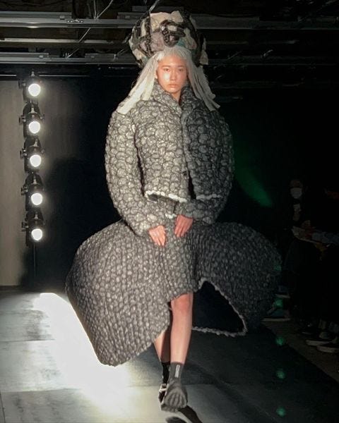
Speaking of Comme des Garcon, Rei Kawakubo made another art project that will or has already inspired her fan club. I think it’s a story about the cuts, the rolls of the materials, and the process of construction. I can’t say it's a construction for the human body or for just a model, a doll. All the distortions are about new forms. Wearable sculptures. I think it’s not important because this collection as any other made by her is an art statement.
I will skip Junya Watanabe collection analysis, if you want you can watch the show. I didn’t like the Tim Burton’s Edward Scissorhands meets the Cure makeup and hair decision, and the whole collection inspired by Plight (The Spiralling of Winter Ghosts), the collaborative album created by DAVID SYLVIAN and HOLGER CZUKAY in the 1980s, doesn’t seems poetic and beautiful to me. What I like the most is the endless play with zippers. Layers of them, differently connected, make a material for the dresses, corsets and jackets.
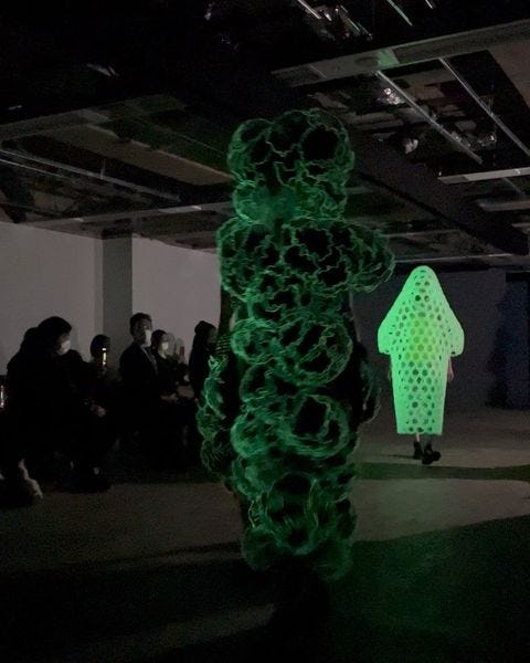
And finally the last but the least - Noir Kei Ninomiya FW22 “FLUORESCENT” collection. It wasn't the only fluorescent show by the way. Dior had a garment as well. But that was the whole show about it. “Creating a new world by mixing different colors to black, which is the identity of noir kei ninomiya. Neon pink, green and yellow. Organic motifs using phosphorescent materials”, - that’s the official description for it. It really looks like microscope pictures of different organic structures became their gigantic versions and learned to walk in darkness.
Under the light you can see fashion. There’s everything from all the Japanese designers I mentioned before: cuts, zippers, multilayered looks with drapes and holes to show the contrast tissues. Elegant suits with clear lines speak in the language of subtle elegance. I think about industrial punk or post-punk fashion rather than sexually charged dark fantasies, no matter the use of leather harnesses. The full furry camouflage styled with pink skirts speaks for the warrior clothes more than for the weird creature. A bit of a mixed message to the audience, but those are still different garments you can combine as you wish when you see them in the store.
Here I end my selection. The only thing I want to add is that there were shows and strange things that are definitely worth mentioning, but in another story. Much shorter, of course.
P.S.
The choice I’ve made is influenced by my thoughts about the fashion industry, the market and by my personal taste.
I left Gucci and Balenciaga, Loewe, Schiaparelli and a few others outside the review intentionally, so I could speak more about the cultural content of the fashion and of the trends.

